Overview
Purpose
Our purpose and passion here at Dry Oar is to create an exciting and memorable experience for vacationers. Whether someone comes to us for a family vacation or a trip with their buddies, we want to give them the unforgettable memories they are looking for. At the same time, we want to create a safe environment for our guides and employees with growing opportunities and to increase revenue for our company so that we can continue to provide the best available training for employees and services to potential clients. This website will serve as the first impression made on our customers. It needs to be appealing to the eye as well as clean and easy to navigate. All information should be clear and concise and colors should be appealing and not distracting to readers.
Audience
Our audience at Dry Oar consists of thrill seeking vacationers. Whether that is families with young kids or older family members wanting a calm and relaxing run, youth groups looking for a big adventure, or a group of adrenaline junky friends, we want to be the one stop shop. Our target audience will be families and young adult groups looking for a way to spend some time in the great outdoors. There is a lot of opportunity with these two groups in the summer time. They will always be looking for a get away and we can serve a wide variety of thrill and skill levels. We will direct our focus toward the adults that would bring youth or young adult groups, as well as parents and adults looking for family vacations, special occasions, and reunions. The colors and fonts used on this website will set the tone for the experience our customers will come to expect. We need design elements that will appeal to this audience. Colors should include brighter earth tones that will make the customer feel excited to go on an outdoor adventure and that would appeal to a younger adult base. We hope to attract adventurous people who are looking for some fun!
Branding
Website Logo

Style Guide
Color Palette
Palette URL: https://coolors.co/264653-2a9d8f-e9c46a-f4a261-e76f51
| Primary | Secondary | Accent 1 | Accent 2 |
|---|---|---|---|
| [#264653] | [#E9C46A] | [#2A9D8F] | [#E76F51] |
Typography
Heading Font: Raleway Medium
This font is perfect for headings with its bold, clean, and legible sans-serif text. It will stand out and allow the readers eye to quickly scan each page to find the pertinent information they are looking for. It's thicker lines pair well with the zilla slab thin font used in each paragraph. There is enough of a contrast between the bold lines of the headings and the thin lines of the paragraph text that the reader will be able to differentiate quickly between the subject heading and the information under it. This will make the transition from searching for subjects and reading the information flawless and easy on the eyes.
Paragraph Font: Zilla Slab Light
It's a thinner serif font that will pair well and contrast with the Raleway medium font. This font is also clean and readable which will appeal to a large audience. If the text in informational paragraphs are too fancy, busy, too close together, or spaced to far apart, it will be distracting to the reader and will repel them from wanting to continue reading. The cleaner the better! But that doesn't mean the text has to be boring. There are many fonts that are modern or interesting that will allow you to acheive the clean look readers are hoping for.
Normal paragraph example
The best Whitewater Rafting in Colorado, White Water Rafting Company offers rafting on the Colorado and Roaring Fork Rivers in Glenwood Springs. Since 1974, we have been family owned and operated, rafting the Shoshone section of Glenwood Canyon and beyond.
Colored paragraph example
Trips vary from mild and relaxing river runs that are great for families of all ages, to trips exclusively for physically fit, thrill seeking adventurers. No matter what type of river experience you are seeking, Dry Oar Rafting Company can make it happen for you.
Navigation
Site Map
The Site Map of a site is just like it sounds…it is a map of the pages in a site and how they are related and linked together. From the map above we can see that we will eventually have the Home page and 2 sub or child pages.
The lines that connect them all together indicate that each page should be accessible from any other page, it is essentially showing us the global navigation for the site.
Wireframes
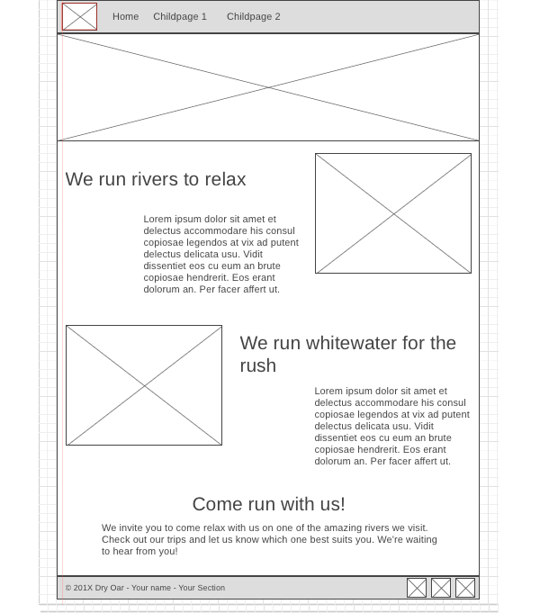
Wireframes are like blueprints for making webpages. They should show the major sections of content that will be on the page and the relative locations of each element. In the wireframe below you can see there will be 6 sections to our page:
- At the top we have a section with the logo (the box with the mountain means an image) and the navigation bar.
- Then there is a banner image that stretches all the way across the screen.
- Next we have some text and an image
- ...followed by another row made up of an image and some text.
- Then one more section of text with no image.
- Lastly, a footer containing a copyright/name line and 3 social media icons.